Shape
The Shape rectangle allows you to draw a variety of geometric shapes and also a flexible grid. The shapes available are:
1. Circle
2. Ellipse
3. Isosceles Triangle
4. Right Right-Angled Triangle
5. Left Right-Angled Triangle
6. Box
7. Polygon
8. Star
9. Grid
The dialog for each varies as the required information for each shape is different. For all shapes except Grid and Box, the area of the rectangle outside the shape will always be transparent.
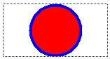
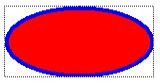
Circle and Ellipse – there are no settings for these shapes. The circle will be drawn to fit into the smaller axis of the rectangle and centered in the other. The ellipse will exactly fill the rectangle. Changing the size and shape of the rectangle will change the size of the circle, and the size and shape of the ellipse. Both are drawn using the Rectangle Color background and border colors. Either color can be turned off, but if both are, nothing will be drawn. The border width can also be set. Here are examples of a circle and an ellipse:
Isosceles Triangle – the settings for this shape are:
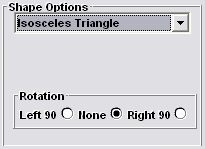
The triangle will normally be drawn with the base down and the apex at the top edge of the rectangle. The shape can be turned 90є either left or right. In addition, the general setting Inverted can be clicked to turn the triangle up-side-down. This can be used in conjunction with Rotation to orient the triangle in any 90є position. Changing the size and shape of the rectangle will change the size of the triangle. It is drawn using the Rectangle Color background and border colors. Either color can be turned off, but if both are, nothing will be drawn. The border width can also be set. A typical isosceles triangle (showing the focus rectangle which does not show on the final badge) is:

Right and Left Right-Angled Triangle – these have all the same features and capabilities of the Isosceles Triangle except that a right-angled triangle is drawing instead. A Right Right-Angled Triangles looks like:

and a Left Right-Angled Triangles looks like:

Box – this shape is a straightforward rectangle using the background and edge colors as for the shapes above. In addition, you can use the Rounded setting in the Style section to round the corners.
Polygon – this is a regular polygon (that is, with equal corner angles) and can have from 3 to 30 sides. The settings dialog looks like this:
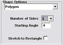
The number of sides is set by the drop-down control. The Starting Angle sets the position of the first corner of the polygon. You can enter any angle from 0є to 360є in one degree steps. Zero degrees is east, 90є is south, 180є is west and 270є north. Here is a 5 sided polygon with zero starting angle:

and here is the sample polygon with a starting angle of 45є:

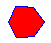
The Stretch to Rectangle setting determines if the polygon should be truly regular or stretched to fit the bounding rectangle. Here the sample polygon is in a wider rectangle with this setting checked:

The polygon is drawn using the background and fill colors, and with the border width set in the Rectangle Color area.
Star – this shape has all the settings of a polygon plus an Indentation % setting. The dialog looks like this:
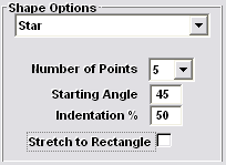
The Number of Points sets the point count for the star and can be from 3 to 30. The Starting Angle and Stretch to Rectangle settings are the same as for the polygon above. The Indentation % setting is a percentage from 0 to 99 and determines how deeply the star is indented. For example, a star with the above settings looks like this:

but if the indentation is changed to 75% it becomes:

and at 25% it looks like:

Some settings of Number of Points and Indentation % can give unexpected results. For example, with 3 and 10% respectively you will get:
This is because the center point of each triangle edge (resulting from selecting 3 points) is more than 10% in towards the triangle center. Thus the "indentation" becomes negative.
The Stretch to Rectangle setting determines if the star should be truly regular or stretched to fit the bounding rectangle, as for a polygon.
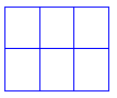
Grid – this is not really a shape but a versatile way of creating a grid of lines on the badge. The settings dialog looks like this:
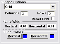
The Columns and Rows values set the number of columns and rows in the grid. You can set each from 1 to 99 (if you set 0 it will be treated as 1). The grid resulting from the above settings looks like:
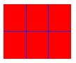
The border is set as for normal rectangles. In the above example the background color was turned off and the border on, with a width of 0.01. If the background was turned on (and red) and the border off it would look like:
Any combination of rectangle background and border settings can be used.
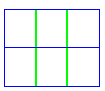
The Line Width settings determine the width of the internal lines. The Line Colors determines their color. If we changed the vertical lines to 0.03 wide and their color to green, the other original settings would result in:
Each vertical and horizontal internal line can be dragged in the design window. Position the mouse over the desired line and left click and drag it to the new position. You cannot drag a line outside the rectangle, or so that it would cross its neighbor. Lines retain their set distance from the top and left of the rectangle so changing the rectangle size will not move the internal lines. If you reduce the size of the rectangle some lines may not be visible. If you wish to return the lines to even spacing within the current rectangle, right click the rectangle and check the Reset Grid box and select OK.
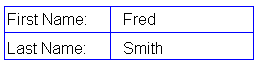
By making the grid have no background you can bound other rectangle types as shown here where 4 text rectangles are on top of a grid rectangle: